Children's Creativity Museum

experience refresh
Refreshed the museum's brand, characters, wayfinding & signage system, focusing on expressing creativity and interactivity in all elements.
duration
jan-Aug 2023
8 months

phase 1: @ TBD* x CCM: experience refresh
phase 2: implementation
my role
graphic designer @ TBD* (phase 1)
design fellow @ CCM (phase 2 summer)

Project type
volunteer pro-bono (phase 1)
contract (phase 2)
SCOPE
Brand refresh, Character design, Wayfinding & Signage, Maps, System, Marketing rack card

TOOLS
Figma, Illustrator, Photoshop, After Effects, Procreate
From an open-ended project filled with possibilities...
Children’s Creativity Museum wanted to rethink its visitor experience and design a system and specific deliverables that would enable that. They left it open for us to suggest what would be best for them. This could be a narrative map, info brochure, stickers, buttons, interactive signage—anything we come up with is on the table!

Their Mission

Children’s Creativity Museum nurtures creative confidence and collaboration in all children and families through hands-on multimedia arts and technology experiences. CCM empowers children to be active producers of digital media instead of passive consumers. CCM values equity, co-creation, diversity, and humility to uplift the community.

01 - critter refresh
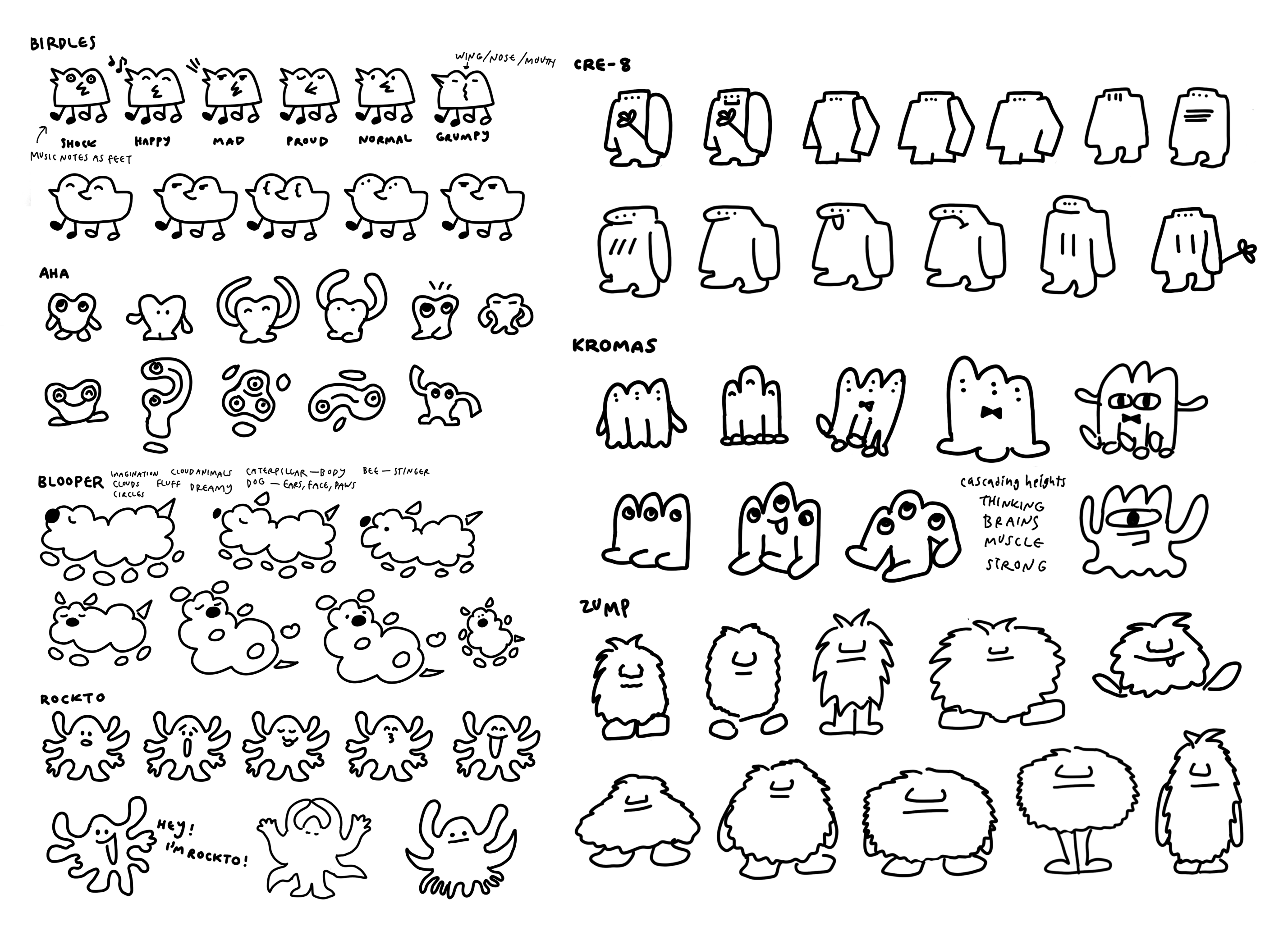
The Critters play a big role in their core identity and distinguishing them from others, but their stories seem disconnected inside the museum.
From our research, we found that the Critters play a big role in identifying their uniqueness and voice as a brand: a symbol of their playfulness and creativity. After deeper research and visiting the museum in-person, we found there was a disconnect between the backstories of the Critters and they were treated more like elements of decoration rather than contributing more to the story and overall experience. Also, there was inconsistency as some of the names were outdated in the files.
How might we approach refreshing the Critters as an extension of branding?
We decided to give the Critters a defined purposes as brand elements. Assigning each critter to an exhibit can help with wayfinding, branding consistency, and color coordination.
‍‍
→ Characters as a system
→ Dimensionality/Dynamic
→ Creating purpose as branding elements
→ Consider potential new additional Critters?
thoughts from client
The Critters feel a bit minimal and without CCM’s “DIY, scrappy, rough around the edges” identity.
We presented 2 directions for the Critters character design refresh to the client. Instead of pushing a minimalistic flat Direction 1, the textured Direction 2 aligned more with CCM's identity. Sam Beutelschies led the character illustrations, backstories, and in the creation of 2 new characters (Telbi and Fwip) for the museum's expanded spaces of the Co-Lab and the new Lightning Lab, which we also suggested names for.
02 - branding expansion
We want an informal rebrand that focuses more on "Creativity Museum."
CCM is for the whole family; balancing child-friendliness with sophistication. They want to be inclusive and hope that even the parents and caregivers who are visiting the museum will enjoy the experience along with the children.
How might we expand the branding system with the new Critter designs we developed?
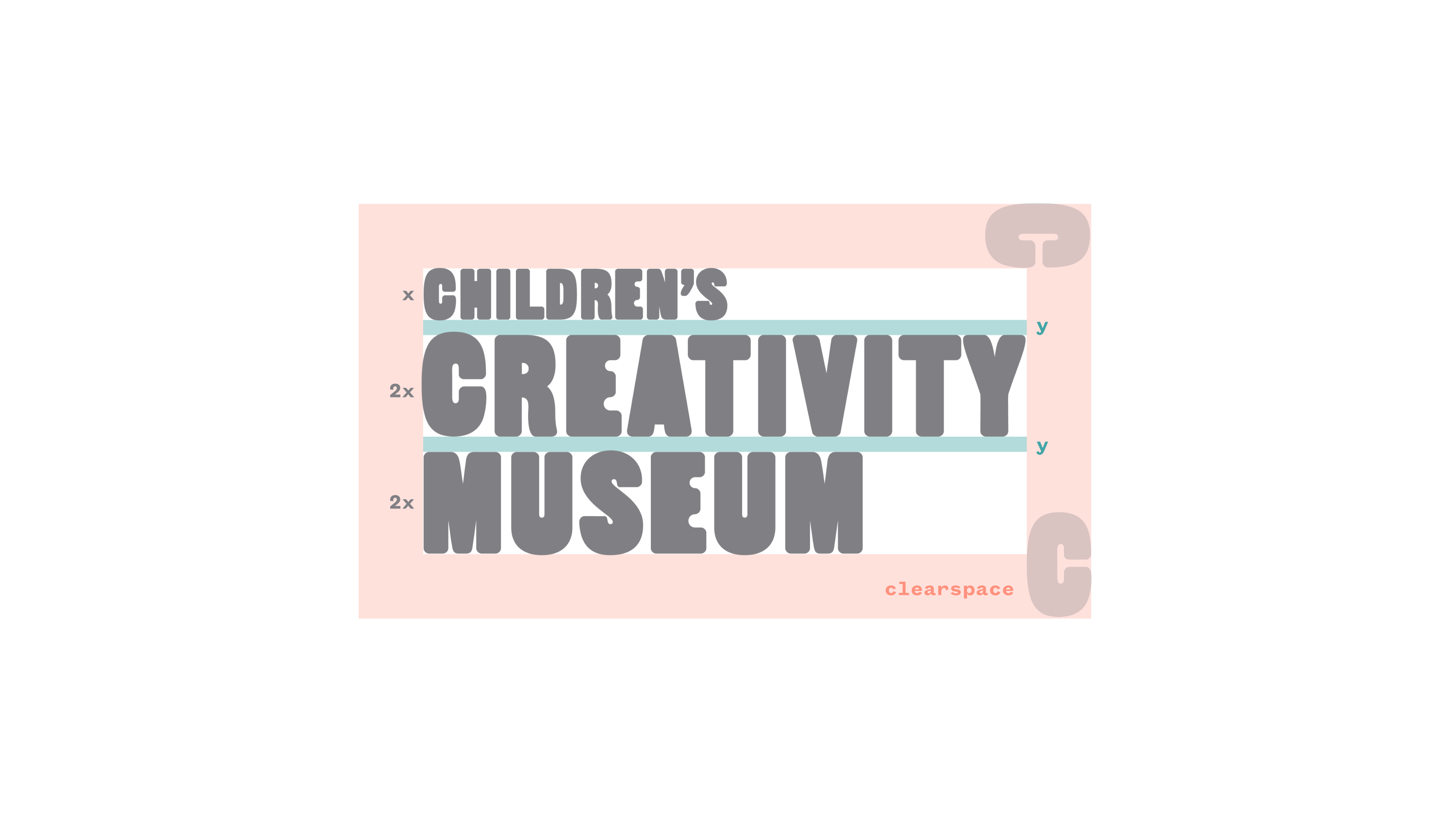
To reflect CCM's decision to focus less on the “childrens” aspect and more on “creativity", we refreshed the logo in a subtle manner. This informed the brand refresh with a minimal change to their existing logo that reduces the size of "Children's" in half of the height to emphasize more "Creativity Museum." We added the refreshed Critter characters to the logo lockups with various versions to choose from.

→ Reflecting CCM core values
→ Incorporating CCM Carol and Henry’s feedback
→ Using brand guidelines to expand the applications of logo and brand colors
→ Giving CCM defined instructions for use of elements
branding one-sheet
As opposed to creating a brand deck, we created a Branding One-Sheet as CCM doesn't have an internal design team and we wanted to make it easier for everyone to access and reference, printed as a poster on their office wall.
03 - map applications
There was inconsistent naming and lack of hierarchy of the exhibits.
All the names of the exhibits existed on the same level; there was no hierarchy, just so many names. However in reality, there was a sense of hierarchy that was just not clarified enough. There were different names of the same exhibit between the online website and the in-person exhibit. (Example: "Digital Flower Garden" online vs. "Community Garden" in-person)
How might we construct the map to reflect our big ideas about wayfinding?
Before designing the map, we established a hierarchy to organize the different levels of exhibit names. Carolyn Kim worked on researching and establishing this hierarchy and created an organizational diagram of the exhibits in the gallery spaces of the 2 floors and outdoors. This would inform the map design and make it easier to understand the overall structure.

→ Emphasize color-coordination for easy navigation
→ Use new Critter designs and personalities as touchpoints for wayfinding
→ Expanding map information to better convey CCM’s identity and values
map
We created a new wayfinding system including a printed map.
CCM didn't have a printed map before. We referenced the fire escape plan, architectural elevations/layouts, and personal measurements upon our visit to the museum.
04 - wayfinding & signage
How might we refine the signage in accordance to our systematic approach?
We established a hierarchy to organize the different levels of the exhibit names. We suggested that they have colored accent walls in the designated color along with white text signage for all the gallery spaces. We also suggested 4 directions for an interactive map wall, but didn't implement it as the scope was too large for the project and we prioritized other things first.

→ Emphasizing a cleaner/more sophisticated look
→ Using branding colors for clearer wayfinding
→ Use spatial design in navigation
05 - collateral system
We employed the refreshed branding & wayfinding system into several applications.
Through the use and expansion of our systematic approach and the guidelines we developed, we can develop collateral that feels cohesive. Including an animated logo, front desk motion graphic, Critter posters, and marketing flyers.
future extensions
We presented several possibilities for future extensions.

→ The modularity of our new system allows for alterations; if exhibits change, it will be easy to alter our deliverables.
→ New critters can be created.
→ Our signage system could be integrated into other museum posters.
→ Potential for additional Critter poses and personalities.
→ Turning the interactive map wall idea into a reality.
credits
This project started in Spring 2023 at TBD* at CCA: a student-run in-house graphic design studio that works pro-bono with Bay Area nonprofits and organizations. Through TBD*, Carolyn Kim and Sam Beutelschies partnered with Children's Creativity Museum for the course of the semester focusing on branding refresh, which then extended into contracts for further projects, encompassing implementing the new design system, marketing, signage, print collateral, and merch design.

Design Strategy: Carolyn Kim, Sam Beutelschies
Critters Illustrations: Sam Beutelschies
Logo: Carolyn Kim, Sam Beutelschies
Animated Logo: Sam Beutelschies
Wayfinding System: Carolyn Kim, Sam Beutelschies
Map Final: Carolyn Kim
Floor Vinyl Sticker: Carolyn Kim
Signage: Carolyn Kim, Sam Beutelschies
Welcome Video: Sam Beutelschies
Rack Card: Carolyn Kim, Sam Beutelschies
Rack Card Mini Map: Carolyn Kim
workofcaro